Designed by: Gary Fussell
Welcome to Dark Works. Our team’s logo was not an easy feat and actually went through several iterations, especially since the name Dark Works comes from when I was a teenager in 2014. In my childhood, I always imagined that the logo would be a black knight, however, as I grew up, my interest changed and so did the design.
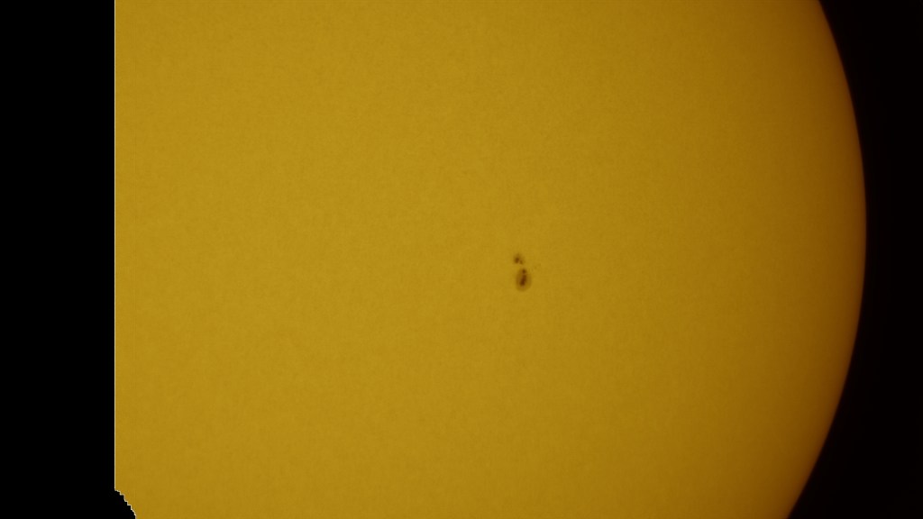
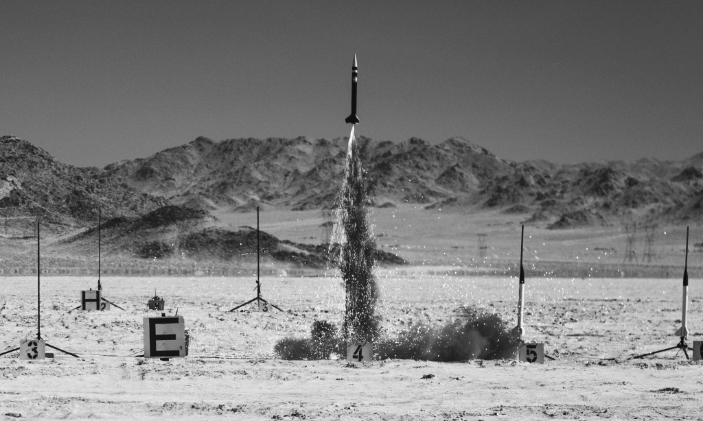
With Dark Works focusing on astronomical and rocketry research, I knew I would love to incorporate both into our design. As such, space, of course, would be the main theme. In our patch, the red line sweeping across the globe represents our aspiration to reach orbit. The dark circle on the sun, symbolizes our exoplanet research using transit events to detect them. Then, with the Sun, Moon, and Jupiter being some of the first objects photographed with our recently upgraded telescope. Then to honor our four founding members, Sarah Wattenberg, Thomas Rapp, Thomas P., and myself, each are represented with a large star. Finally, there is a Ursa Major constellation, appearing as a semi hidden nod to one of our favorite constellations and my favorite animal, the bear.